
…
There. I said it. Somewhere along the way, Instagram lost the plot a little. What started as a visual platform built around beautiful photography, creativity, storytelling, and aesthetic identity has slowly become… a digital fly-posting wall.
“LIVE MUSIC THIS FRIDAY!” / “2 FOR 1 COCKTAILS!” / “QUIZ NIGHT TONIGHT!” / “BOOK NOW!”
All slapped directly onto the grid in giant fonts like someone attacking Microsoft Word circa 2007. And honestly? It’s exhausting.
The Grid Was Originally Meant to Flow
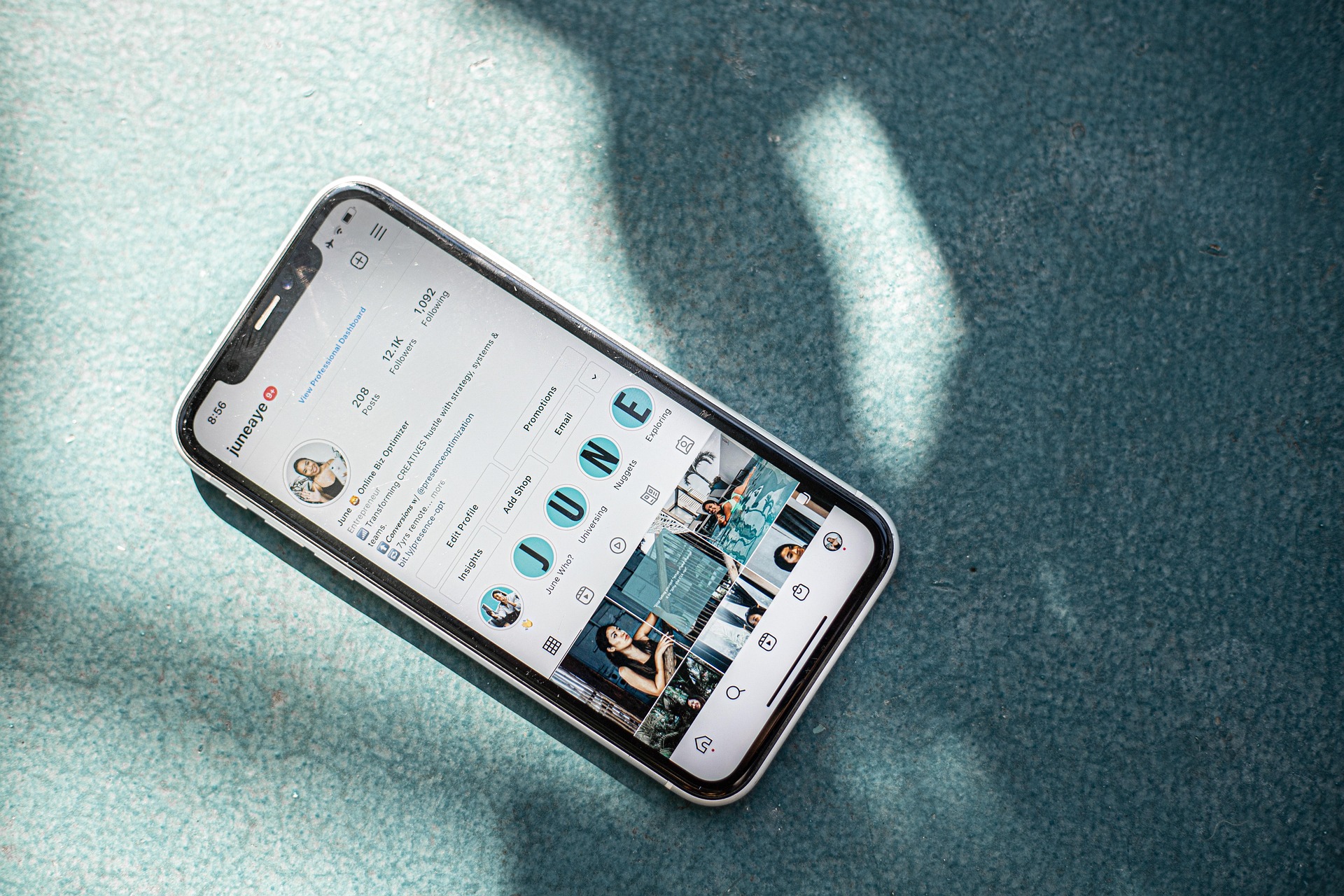
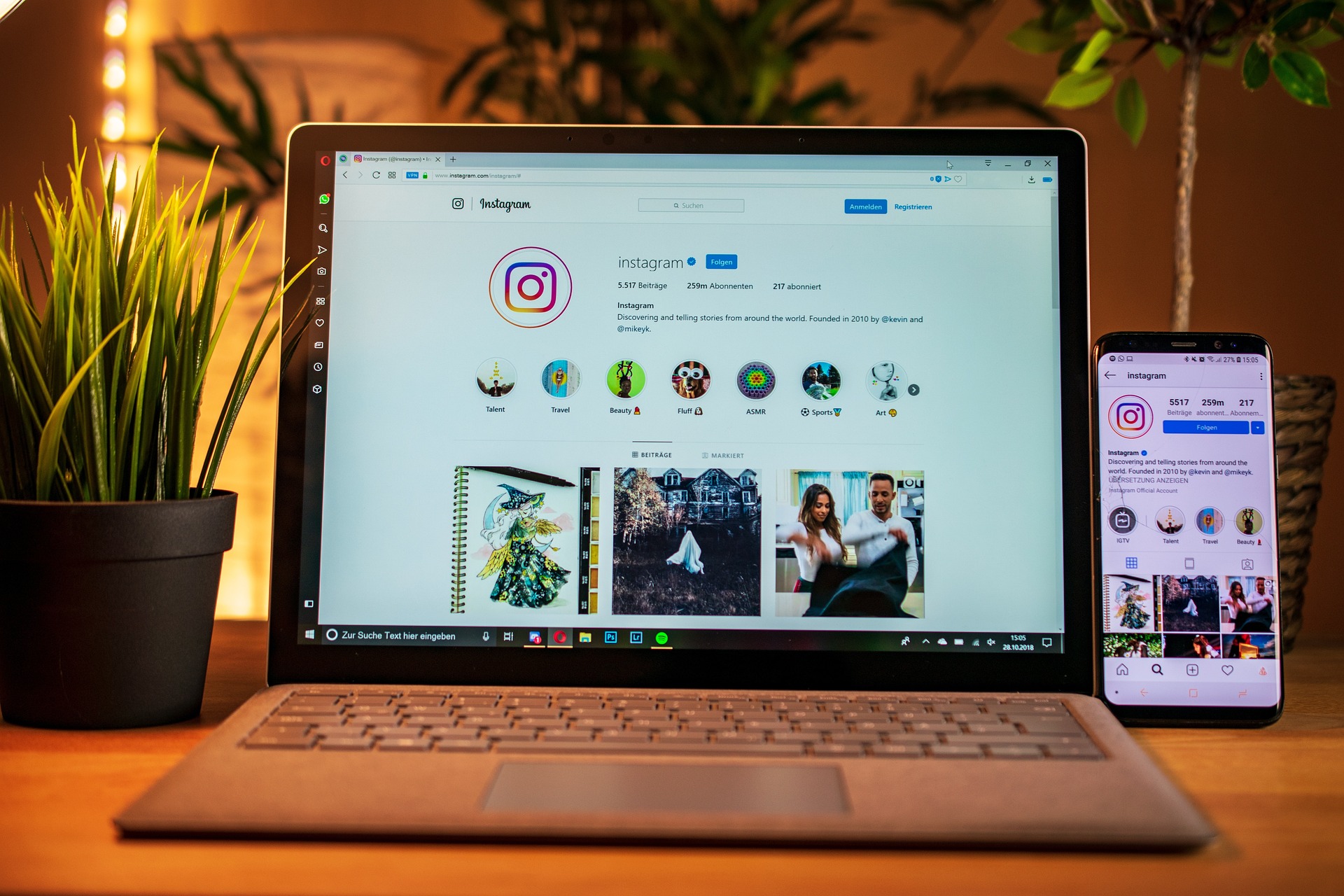
Instagram’s entire design is based around visual browsing. Unlike Facebook, where posts disappear quickly into a fast-moving feed, Instagram profiles are explored visually. People click through and scan the overall feel of your page in seconds. Your grid is your shop window. It tells people: Who you are; Your style; Your quality; Your vibe; and Whether they want to follow you. Eesh! When every other square is a badly cropped promo poster with seventeen fonts and a blurry logo stretched across it, the experience becomes chaotic. And the worst part? Most businesses don’t even notice because they’re posting at Instagram rather than understanding how people actually use it.
Instagram Is Not “Just Another Facebook”
This is where the confusion happens. Facebook works well for: Information; Community updates; Events; Shares; Posters and Local notices… Instagram works better for: Atmosphere; Personality; Visual storytelling; Brand identity; Lifestyle and Behind-the-scenes content. They overlap, yes. But they are not twins. Treating Instagram exactly like Facebook is a bit like hanging nightclub flyers inside an art gallery. Technically allowed. But deeply jarring.
The Problem With Graphic-Heavy Promo Posts
Now don’t get me wrong. Promotion matters. Businesses need to advertise events, workshops, launches, offers, and bookings. But the issue is how it’s done (and why, usually down to laziness). Many promo graphics: Are overloaded with text; Don’t fit Instagram dimensions properly; Ignore visual consistency; Use low-quality imagery and Instantly date the grid after the event passes. So your lovely café, salon, venue, or creative business suddenly looks like: “TRIBUTE NIGHT FRIDAY £5 ENTRY LIVE DJ BOOK NOW CALL DAVE.” Not ideal.
Stories Exist For A Reason
This is my slightly controversial opinion: A lot of posters belong in Stories, not permanently stamped onto the grid (though I might let you get away with a Pinned Post). Why? Because Stories are: Temporary; Fast-moving; Designed for updates; Perfect for reminders and announcements and are Less disruptive visually. They’re brilliant for: “Tonight only!” promotions; Countdown reminders; Quick ticket pushes; Last-minute availability and Event resharing. You can still highlight them afterwards in organised Story Highlights if needed. That keeps your actual grid cleaner and more timeless.
What Should Go On The Grid Instead
Your grid should communicate your brand visually. That doesn’t mean everything needs to look beige, minimalist, and terrifyingly curated like a Scandinavian candle company.
It just means:
- Use consistent colours
- Use quality photography
- Show people, atmosphere, products, process
- Let the business breathe visually
Instead of posting a giant event poster, try:
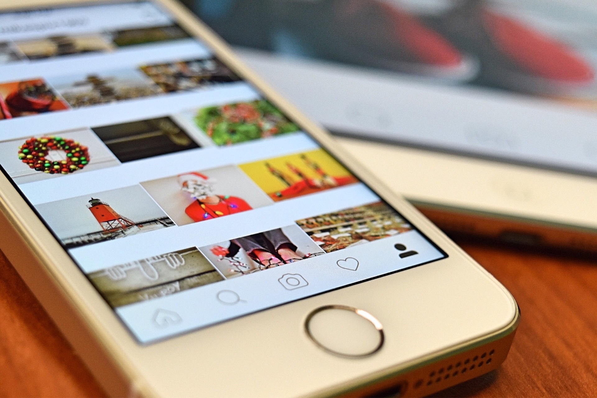
- A photo from a previous event
- A short Reel showing setup or atmosphere
- Behind-the-scenes clips
- A portrait of the performer or host
- A carousel mixing visuals with a single promotional slide at the end
That way the promotion still happens—but the grid still feels human.
“But We Need People To See The Information!”
Absolutely. And this is where balance matters.
You can still:
- Pin key posts
- Use Stories heavily
- Include event details in captions
- Link through to booking pages
- Share posters occasionally (but please archive once the event is over).
But not every single update needs to dominate the visual identity of your page. Because here’s the thing businesses forget: People often decide whether to follow you before reading a single caption. They look first. Then they engage.
The Bigger Issue: Posting Without Strategy
A lot of businesses treat social media like a panic button. “We haven’t posted in a week—quick, slap something up!” That’s how you end up with: Random graphics; Inconsistent branding, Cropped posters and Desperate sales messaging. Good Instagram marketing is less about posting constantly and more about posting intentionally. One thoughtful, visually strong post often outperforms five rushed graphics.
…
Instagram doesn’t need to become an overly polished museum piece (And now I’m concluding, don’t get me started on Cross Posting!). But equally, not every event poster deserves permanent residency on your grid. Your profile should feel: Cohesive; Inviting; On-brand and Recognisable. Stories are fantastic for fast-moving promotions. Pinned posts are useful for priority events. And the grid? The grid should still feel like you. Because when someone lands on your profile, they’re not just deciding whether to attend your quiz night. They’re deciding whether your business feels worth following at all.