Marks Insurance Consultants – Sutton Coldfield
Project Details
Date December 2020, UPDATED October 2025 (New Logo)
Skills Website Design & Development, Website Hosting, SEO (Search Engine Optimisation)
Industry Business Insurance
Website Platform WordPress & Divi Theme Builder
View marks.insure
Legal DECEMBER 2020 / CASE STUDIES ADDED JANUARY 2021 / COMPLIANCE 2023 ©
Case Study: Marks Insurance Consultants – Insurance, But Make It Sophisticated
A Website for When Your Policy Needs to Pack as Much Punch as Your Personal Brand
The Client
Let’s face it—insurance rarely tops anyone’s list of thrilling website projects. But when Marks Insurance Consultants of Sutton Coldfield came to me for a new website, it was clear: they weren’t looking for bog-standard, beige corporate copy and a photo of a man in a grey suit staring at a laptop.
They’re independent, experienced, and exceptionally professional—but they also wanted to show some warmth. Real humans, real expertise, and a business with heart.
Established in 1990, they’re not new to the game. Their work helps businesses protect what they’ve built—because when disaster strikes, the right insurance is the difference between bouncing back and losing it all. That’s serious stuff. But the presentation of it? That’s where we worked our magic.
The Website
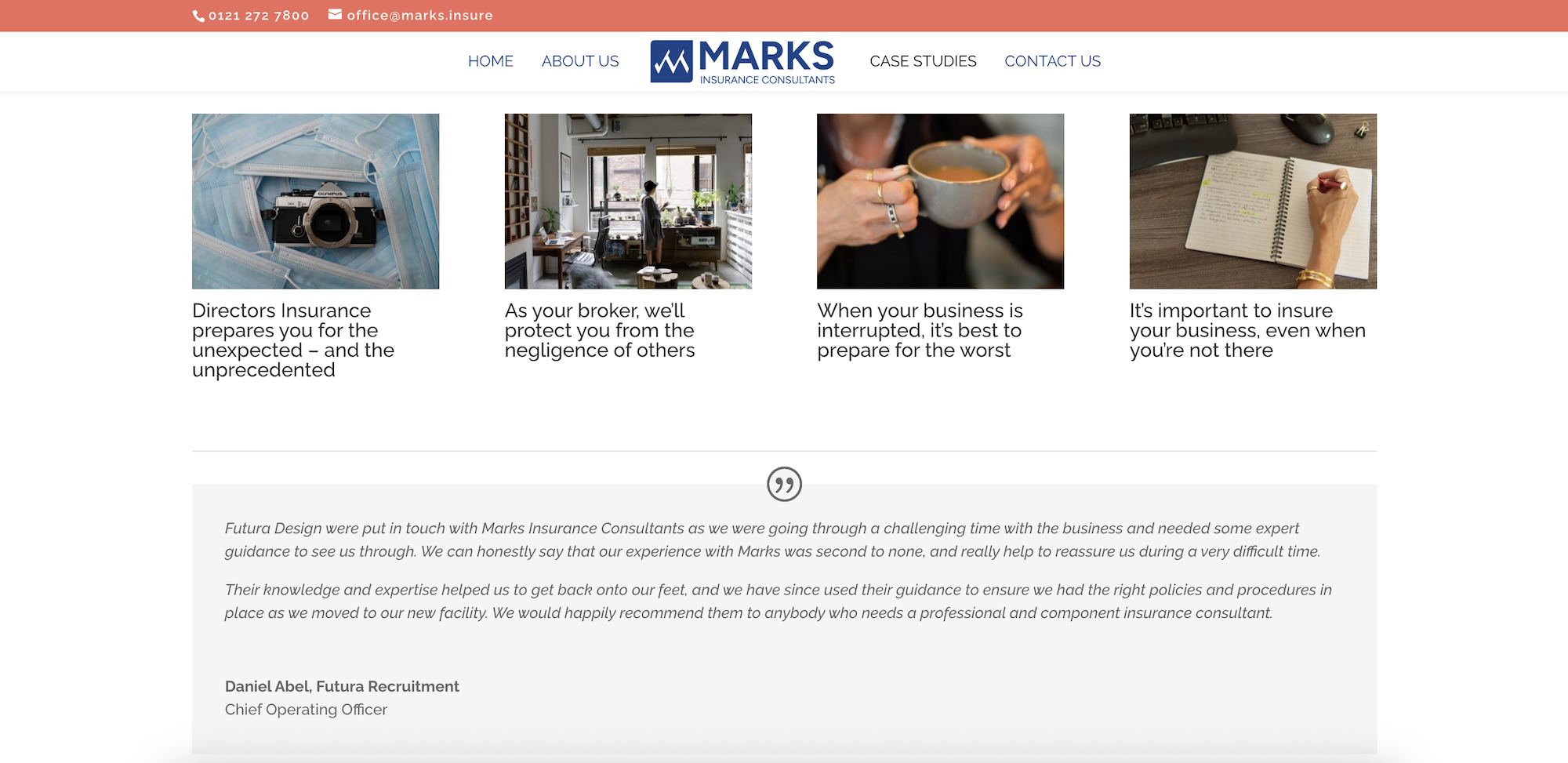
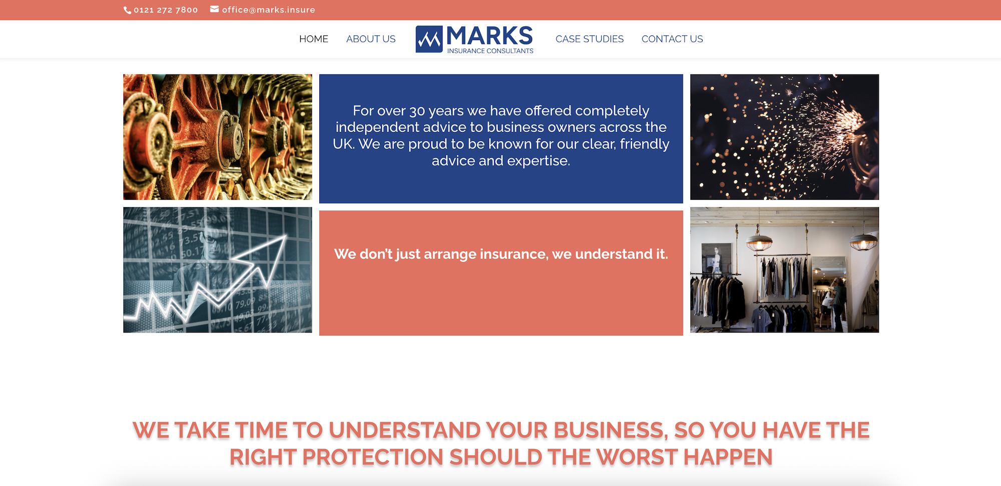
Design Tone: Calm, assured and just a little bit luxe. The layout is minimal, but not cold. Every section has room to breathe—making space for the message to land and the visuals to shine.
Functionality: Simple navigation, easy-to-update backend, and thoughtful accessibility choices for a broad client base. Users can get to what they need quickly—whether that’s booking a consultation, learning about risk management, or reading up on Directors’ responsibilities.
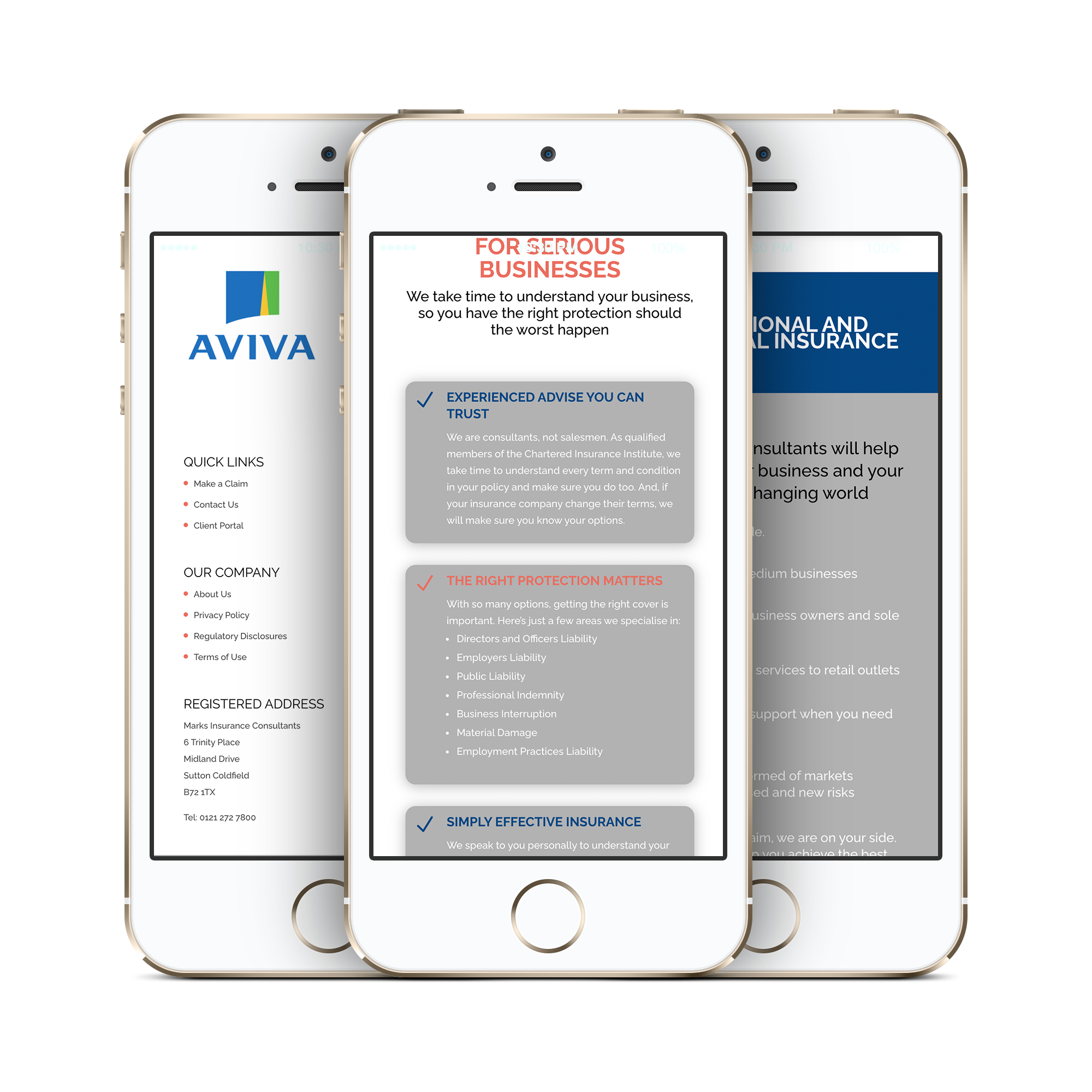
Mobile Performance: Sleek and responsive on all devices. The team often meets clients on the move, so the site had to be as smart on mobile as it is on desktop.
The Brief
“Can we make insurance less… dull?”
That was the challenge—and a brilliant one. The client wanted a site that still felt mature and trustworthy, but with a confident, modern look and a friendlier tone. No insurance jargon overload. No cliché stock photos of handshakes or puzzle pieces. And absolutely no snooze-fest layouts.
It needed to communicate expertise and trust—but without draining the life out of the room.
The Process
This was a dream collaboration from the get-go.
Copy by GE Copywriter – Striking that elusive balance between reassuring and refreshing. The wording is thoughtful, well-structured and accessible, making complex ideas digestible without dumbing anything down. It speaks to the reader, not at them.
Photography by Tina Hart (Capture24) – Tina brought the site to life with personality-packed, professional photography. No forced poses here—just real people, relaxed energy, and a sprinkle of luxury. Think: on-the-way-to-the-next-big-meeting but stopping at a wine lodge for a glass of inspiration.
Web Design by Yours Truly – With such strong assets, I focused on clean, clear structure and elegant details. We paired sharp typography with a confident layout, subtle animations, and a splash of sophisticated colour to keep things engaging without being gimmicky.
The Result
The new Marks Insurance website now sits confidently in the space between expert-led and approachable. It’s the kind of site that makes people pause and go: “Wait, is this… an insurance website? And why do I suddenly want to read more?!”
It feels polished, intelligent, and quietly powerful—just like the team behind the business.
Client Vibe Check:
“It’s exactly what we didn’t know we needed. We look like a modern, established firm—but with warmth. It actually feels like us.”
If your business is quietly brilliant but stuck with a website that whispers beige, let’s turn it into something bold, beautiful and unmistakably you—cocktails optional, though highly recommended.
Fully Mobile Responsive